The klicO team introduces a new and innovative range of everyday cleaning products, using the evolutionary CLICK & USE technology. For those who are making smarter choices for a greener world.
/THE BRIEF
Develop a brand identity that would feel modern and playful to the eye, and convey the message of eco living and emphasise easy use.
/DELIVERABLES
Brand Identity
Logo Design
Corporate Stationery
Packaging
Website Design & Development
OUR WORK
/THE LOGO
We developed a logo that looked playful and simple. We also developed a complementary water drop visual element that was drawn from 3 shapes: water – leaf – and heart. The color combinations we used were aimed at provoking the feeling of cleanliness and a greener way of living. We also developed the brand moto “Life meets Nature” in order to combine everyday living habits with a more sustainable lifestyle in use of everyday cleaning products. The CLICK AND USE logo marking was also designed in order to have a separate section in explaining a new way of using the packaging.
/DESIGN ELEMENTS
We designed the accompanying promotional printed material with a playful doodle pattern that included visual elements of everyday house life, but also scientific visual elements in order to balance out the easy inference of a playful and easy to use product with the scientific research and quality status of the product’s efficiency.
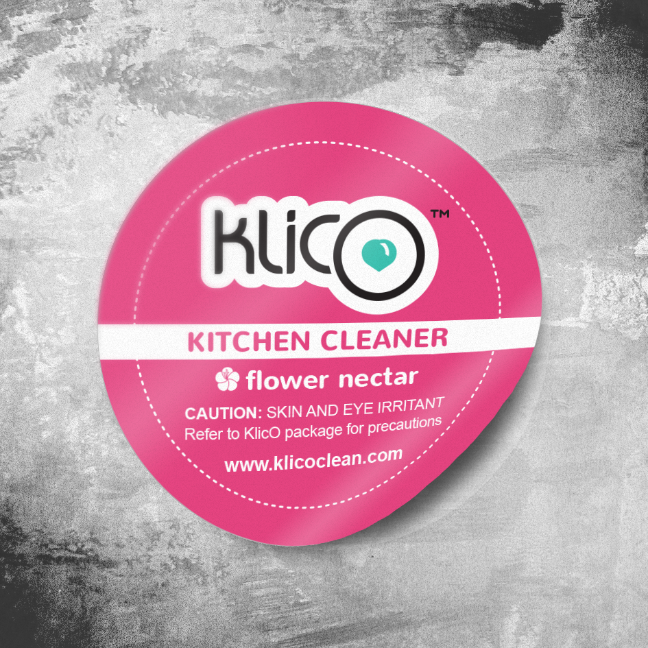
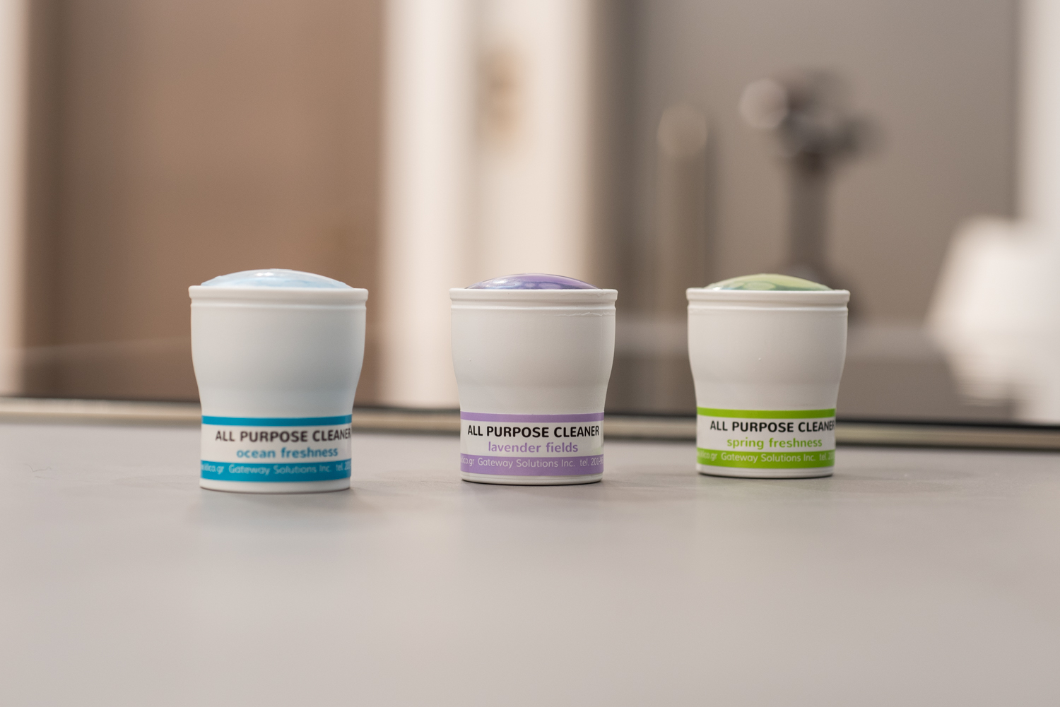
/PACKAGING
The product line colors were selected from their perfume sense and associated with their cleaning categories. The sme playful doodle pattern was included as a product background for the B2C market. The blister shape was designed based on the water drop visual element to make it stand out on the display shelves. The B2B packaging followed stricter design elements, without however excluding the use of bold and bright color additions, to maintain the brand’s playful character.
/THE WEBSITE
Bold colors, playful patterns and useful trivia contributed in stressing a heavy environmental issue -the use of plastic- a lighter perspective without however undermining the weight of its importance.
We use cookies on our website to give you the most relevant experience by remembering your preferences and repeat visits. By clicking “Accept”, you consent to the use of ALL the cookies. Read More
This website uses cookies to improve your experience while you navigate through the website. Out of these, the cookies that are categorized as necessary are stored on your browser as they are essential for the working of basic functionalities of the website. We also use third-party cookies that help us analyze and understand how you use this website. These cookies will be stored in your browser only with your consent. You also have the option to opt-out of these cookies. But opting out of some of these cookies may affect your browsing experience.
Necessary cookies are absolutely essential for the website to function properly. This category only includes cookies that ensures basic functionalities and security features of the website. These cookies do not store any personal information.
Any cookies that may not be particularly necessary for the website to function and is used specifically to collect user personal data via analytics, ads, other embedded contents are termed as non-necessary cookies. It is mandatory to procure user consent prior to running these cookies on your website.